Update June 2025: Center Parcs have changed to using Monta for their EV charging. Add Jam have extensive knowledge of developing software using the Monta Partner API, contact us if you want to build something using Monta.
A frustrating destination EV charging experience at Center Parcs
As a seasoned EV driver and software developer who has worked on several EV charging products such as Bypass and the Urban Fox chargepoint operator, I've seen firsthand how the user experience can make or break the adoption of electric vehicles. Unfortunately, during a recent holiday at the Whinfell Center Parcs in Penrith, I encountered a prime example of how NOT to run a modern, usable charge point network and encountered one of the most poorly designed mobile apps I've EVER used.
The app in question was Vend Electric, which Center Parcs uses to manage EV charging for guests. The concept is clever - you park your car at the start of your stay, and at some point before you leave, your vehicle gets charged up. It should in theory work great for guests (drop it off at the car park and come back to a full tank with no effort) and for Center Parcs or the operator by allowing them to balance load and/or take advantage of agile energy tariffs. In theory, it should be a holistic, seamless experience.
The good
I don't want to come across as overly negative here, not least I do fully believe EVs are the near term future of mobility and I don't want to add a voice to the anti-EV hate. I'm a motorsport loving petrol head but I can't stress enough how enthusiastic I am about electric vehicles. The EV driving experience is great for most of the driving most people do most of the time.
Center Parcs have clearly bought into the EV future too. There are so many charge points in the car park (most of them went unused at the moment) which is great to see and the ability to prebook means you don't really need to put much effort into charging for your return journey.
Cost wise, at 44p/kWh its not 'cheap' but considering they have a captive audience in people holidaying at Center Parcs that's not too bad. Sure, it pretty much matches Tesla Supercharger prices but its also substantially cheaper than the other choices for Center Parcs holiday makers at services on the route back home on the M6/M74 like Gridserve (79p/kWh), Applegreen (77p/kWh) and Ionity (74p/kWh)
The bad
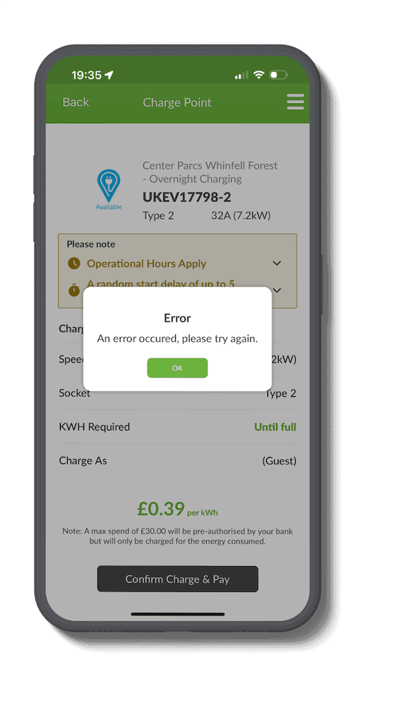
So the potential is there for a seamless experience however in practice, it was anything but. From the moment I pulled up at my prebooked parking bay and attempted to plug in at my pre-booked charging bay, I was met with unhelpful error messages: "An error occurred, please try again". Repeated attempts at both connectors yielded the same result. Moving to another bay, I scanned the QR code only to be informed the point was "unavailable", with no further explanation.

Frustrated, I dug around the clunky app, hoping to find a way to contact support or at least leave feedback about the issues I was experiencing. To my dismay, I found no clear path to do either (turns out there's an item at the bottom of the hamburger). I couldn't help but wonder how many other EV drivers were silently struggling with the same terrible experience. Getting user feedback (both good and bad) is important, especially so when you're a charge point operator.
Perhaps my failing was in understanding how the hell you're supposed to use the app as a guest. The confusing checkout flow really pushes users to become a full member rather than a guest (the remember me checkbox is really make this a full account button). When I finally got a charge session started it was not through the mobile app but instead a web app that required me to create an account anyway and then load money into a Vend Electric wallet - funds which I now have to jump through hoops to retrieve, with a 7 day wait time.
How could it be improved?
This really could be a seamless experience. I booked the holiday directly with Center Parcs, they have a concept of an account, the same account used to prebook the charging bay and with billing details already associated with it so the charging session could just be tacked onto my holiday booking.
Even if this was too much of a stretch the Vend Electric platform itself should be much better. There are parts of the app and website that are literally at the level of a university project. As a developer, a few key improvements stood out to me:
- Provide clear, helpful error messages and feedback to the user when things aren't working. If it's something the user can do differently let them know.
- Easy access to support and a way to provide app feedback, don't bury a contact form in a menu. If it's not working be proactive in offering support to the driver.
- Fixing loading state issues to avoid user confusion, the app is always loading. Always. There seems to be no client side caching, its slow and frustrating experience on wifi, glad I didn't have to endure it over 4G
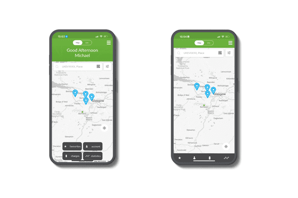
- Updating the app UI to properly fit modern device screens. The concept of a notch was introduced in 2017. In 2024 the app doesn't render well with my iPhone 14 Pro and the Dynamic Island.
- Use consistent navigation patterns. I'm not entirely sure how I managed it but the default view of the home screen is 4 buttons in a grid but sometimes these options render on a tab bar.
- The app is using a web wrapper of some description. How can I tell? It 'feels' far from native to begin with but a big give away is the amateur setup for instance not disabling pinch-zoom so you can zoom out screens you're on

The experience served as a stark reminder that no matter how innovative your service offering may be, if the user experience is clunky, confusing, or broken, you'll drive away more customers than you attract. At a more profound level it brought home how far we have to go to make EV adoption a no-brainer - it pains me to say it but in 2024 there are CPOs that are shipping software likes its 1992. As developers, it's our responsibility to test rigorously, seek user feedback, and continuously iterate to craft apps that delight users and make their lives easier.
At Add Jam, our team of expert designers and developers is committed to building intuitive, user-friendly apps that showcase the best of your brand. From mobile apps in React Native to robust web applications in Ruby on Rails and TypeScript, we have the skills and experience to bring your vision to life. Let us help you avoid the pitfalls of poor UX and create a product your users will love. Get in touch today to start the conversation.


